Making notes: In the video the lady said that she was going to focus more in the dark shading and make notes of the darker shades to make sure she is on target. She would darken the spots that make it more obvious that it is a face portrait like example his hair and his jawline. Also when she was doing the light side of the face she would take notes on where his ear would be to structure the face properly and to draw where the forms of his face should approximately be. Making note is where something should be around not exactly where it is but getting an idea of it.
Pushing: In the video she would push the dark shades in more for example in the eyes which is doing deeper with the charcoal and making it darker.
Modelling: In the video the lady was trying give some highlights with white and she said she was just modelling and it will not be exact because it is more of an idea where it should be.
Photocopying mode: This means that when we are doing the playful portrait we should think like a photocopying machine so we can see the light and darkness of the image. Squinting works to separate the dark from the light. Photocopying mode is when the picture is black and white.
Describing: She added negative space to describe the edges of his face.
Not symbols: Not symbols means that draw the portrait playfully and not worry if it looks like a person or not. It should just be loose and looking for the form not really focusing on making the features and symbols exact.
Friday, 16 May 2014

Monday, 28 April 2014
Fonts of company logos

All these logos have different fonts. These logo fonts aren't chosen out of the blue, they all have a good reason for the font, the colour etc. The powerful cars have thicker and bolder fonts while the elegant and classy ones are thinner. All the fonts are legible and clear to read. The colour of the fonts are either black, blue or red in this picture.
Monday, 21 April 2014
FRANCIS BACON
 Francis Bacon's painting is interesting because the face is not how a face would typically look. The lines and colours make my eyes follow along. The colours chosen are all deeper tones and more mature looking. The shapes of the features on the face are disproportional. There is value changes ranging from black to white, dark to light. There is both positive and negative space, the negative space is all back but the positive space has more variety of colours. The painting interests me most by the colours used to show the face features and how they are not how typical faces look like but it is very interesting because I don't often see self portraits that look like this!
Monday, 14 April 2014
Egon Schiele
 Egon Schiele's artwork interests me why the way the picture is painted. The lines on the face are used to represent the deep inner emotion, disturbance, and lack of peace. The body is outlined by a different colour than the rest of this art piece. The lines going to the stomach abruptly stop which makes him look very malnourished.The lines on his ribs are deepened by the shifts in colour showing the ribs are exaggerated making me think that he is tortured and starving. The colours make this piece interesting because its all the very close in colour and when the white is used it really brings the eye to the body structure. The shape in this painting is organic and all of the parts of the body looks rather hollow. The texture looks sharp because of the bones that are shown and rough because of the way the darker colours are added on the body.The picture has a good amount of negative space and the positive space is really busy looking by all the different shades of the colours. This artwork is interesting to me because not only how it looks like but also because the story behind it.
Wednesday, 9 April 2014
Michelangelo artwork
 Michelangelo's artwork has a lot of meaning to it. This has the element of space in it because there is open space and closed space. It is busy where Adam and God are, bringing the focus away from the negative space focusing on the limited amount of space between the fingers. Thus exaggerating the importance and significance of the space between the two fingers showing us the meaning behind this artwork. The meaning behind space where Gods in looks like a brain, this shows that Michelangelo was connecting God to human nature and the works of our brains. This space is busy because when we think of God it has a big impact on humans.
Tuesday, 8 April 2014
Giorgio DiChirico
Giorgio DiChirico

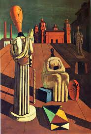
Giorgio's artworks is very perspective and empty in the terms of space. The mood it give off to me is lonely and empty. Because of the emptiness of the pieces it makes me feel lonely in a way and depressed in a way. The colour that are used are not every vibrant bold colours, they are toned down and settle. These pieces look very ancient and old. These pictures have open space and are three-dimensional because they are perspective art pieces. Giorgio's art is depressing and makes you feel lonely because a lot of the space is not being used and is very empty. It looks like if these are actually real places, no one has visited for thousands of years and it is just left the way it was long time ago. Even in the second picture they heads of the statues are empty!
Monday, 31 March 2014
Space
Space is a very unique element of art. You can perceive space my your senses. Space can make you feel differently depending on how much space you get. If you are in an elevator with a lot of people, you probably wont feel comfortable because you are given a small amount of space. There are many types of space such as : positive space, negative space, open space, closed space, inner space, outer space, personal space etc. Space refers to distances between objects and also the implied space like what can be achieved in a perspective drawing.


These pictures all show types of space. The top two pictures show the difference between positive and negative space where the positive space is white and the negative space is black. You can see the space between the shapes and the open space in the background. The last drawing is a one point perspective drawing, and this shows three- dimensional, sometimes space is not within a piece but the illusion of it is. You can see the open space at the front of the picture and see that the road narrows, this gives an illusion of space.
These pictures all show types of space. The top two pictures show the difference between positive and negative space where the positive space is white and the negative space is black. You can see the space between the shapes and the open space in the background. The last drawing is a one point perspective drawing, and this shows three- dimensional, sometimes space is not within a piece but the illusion of it is. You can see the open space at the front of the picture and see that the road narrows, this gives an illusion of space.
Monday, 3 March 2014
Value

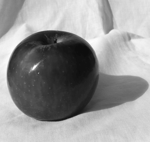
These pictures show the element of value. Value refers to the lightness or the darkness of a colour. You can see the form of the shapes because of the values in them. You can tell if the edges are rounded or sharp by the gradual shift or by the sudden shift in value. Some ways to create value such are by : stippling, shading, cross hatching and parallel hatching.
Tuesday, 25 February 2014
Blind Contouring


These are some great examples I think of blind contouring. This is what I'm aiming for my the end of this project. So far, I have been practicing at home my blind contouring by shutting my one eye and moving my pen at the same speed as my eyes are moving from the object I am trying to draw. Slowly I have noticed some improvement in my work because I have been practicing. These two blind contours is what I want my art to look like. I think these are both really great blind contours because you can tell it is real and not just a fake "blind contour" because the lines are not perfect and perfect is not what the focus on this project is about. You can tell that the lines are all connected and they have not looked at their page while they were drawing this. I like the effect the colour on the first image has. This is something I could get ideas from for my project because they have chosen limited colours and have coloured different shapes that were created by the lines. I will keep practicing to not look down at my page while I am drawing and fix my eyes on the outline of the objects I draw and track my eyes, going very slow and steadily to achieve the blind contour that I like. This will take a lot of practice but I am up for it!
Wednesday, 12 February 2014
Hellenistic Period


The Hellenistic period have developed much from the Archaic and Classical periods as you can see with all the detailing and exaggeration. If you look close up in the mans face you can see the precise detailing with his facial hair. You can see the muscles look more realistic and human-like compared to the sculptures in the Archaic period. If you look closely you can see how the feet are as if they are real! They have stretched their skills from the earlier time periods. The faces look more exact and realist with some expressions as well. The impressing thing is that it is done in marble!
Classical Period

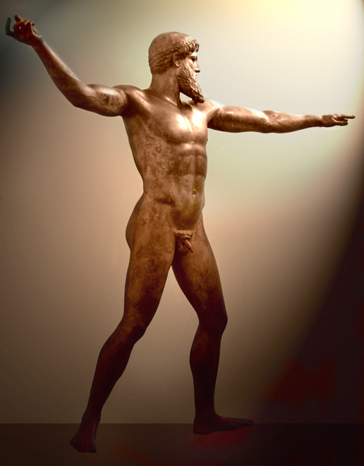

These sculptures in the Classical period have developed from the Archaic period as you can see. These sculptures are more precise and detailed. They took the regular stiff sculptures and became more creative and started making it more human-like and they have more movement.
Greek Kouros from the Archaic periods of Greek history


This is a picture of Greek Kouros from the Archaic periods of Greek history. Kouros was made from marble and it stands for a cultural revolution.These Kouros are very stiff and old compared to the sculptures in the other periods of time in the Greek history.
Subscribe to:
Posts (Atom)